


 Overview
 What's new
 How to Use
 Step by step
 Video tutorials
 Technical Questions
 License Questions
 Recent Questions
 Demos
Demos Bulgy
Bulgy Magnetic
 Fair (RTL mode)
 Push Tall (responsive)
 More demos
 Download
 Contact
Mega Drop Down Menu with Pure CSS!
 FREE download
 More demos
CSS Mega Menu Examples
 Item 0
 Item 1
 Item 1 0
 Item 2
 Item 3
Pure CSS Mega Drop Down Menu
The amount of content displayed on today’s popular websites and online news sources is staggering. Web design experts have been struggling to find the best ways of organizing all those articles, pages and posts in a way that would not make the site seem overcrowded and bloated. Starting pages pose the biggest problem, because they have to reflect the overall concept of the site without turning off visitors with walls of text or a rainbow of colorful pictures that seem to jump out from the screen. Fortunately, the problem is about to be solved by CSS mega menus.
The best way of dealing with this issue is to only fill website front pages with the most relevant information and content, leaving the rest of the site to be represented by links in its navigation menu. With the limitations of HTML and CSS capabilities being common knowledge, this approach has worked well in the past.
However, with the advent of spectacular Web 2.0 interfaces designed by multinational companies, Internet users no longer take kindly of incomplete front-page experience and webmasters are forced to reconsider their way of dealing with the matter to avoid losing visitors.
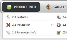
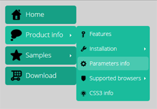
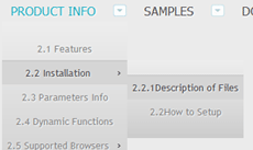
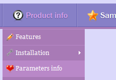
Mega drop down menus, made available through more advanced capabilities of CSS and CSS3, are nearly screen-size pages that remain hidden from the eyes of a site visitor until a mouse hover event is detected on a particular area. This function is similar to creating a sub-menu for navigation bars, only in this the sub-menu offers not only links to the pages with relevant content, but the content itself, complete with text, pictures and everything else by virtue of being absolutely huge! That is the reason why this type of multi-column sub-menu is referred to as a mega menu.
CSS3 mega menus have become especially popular among sites that deal with online news publications or commerce, allowing visitors to quickly get an impression of the site’s content without actually browsing it. Naturally, this increases the chances of a product or news story to catch someone’s attention and prompt further interest, possibly resulting in monetary gain for the website.
A good mega menu example is the page preview feature of Google search results. Although not generated by hovering over the site’s navigation bar, it displays content behind the destination link without having to follow through. It increases the likelihood of an Internet user to be introduced to the content and saves time, which is essential in the modern online environment.
The best thing about creating transitions in CSS3 is that they will still work when accessed from an older browser that does not support the latest version of CSS. It will disable a couple of extra features in the process, but will not hurt your site’s visitors. Extra features and smooth transitions will make your website look polished and professional, but before switching to CSS3, consider your options.
Now is the best time for webmasters to apply this effective feature to their own sites. Although every CSS3 mega menu bears some likeness to an actual website page, only slightly smaller, it takes practice to get it right. While proceeding by manual use of CSS code can create good results, sometimes the better choice is to make use of the different types of CSS mega menu templates found online or turn to help of professional website development software. In some cases, simply using a web menu building application like CSS3 Menu will be enough.
See also:
CSS3 Rounded Corners,
CSS3 Shadow,
CSS3 Animation,
CSS3 Text Shadow,
CSS3 Gradient,
CSS3 Transition
Download Free CSS Mega Menu Maker
Recent Templates

FAQ
- June 23, 2014 How can i setup css horizontal menu mega menu bar?
Hi, Currently I'm using version 5.2, how can i setup mega menu bar? thank you
- April 02, 2014 Create mega menu in css dropdown menus
Thank you for you response email - I thought your product was a mega menu not just a program to create regular that I can do in dreamweaver.
- December 09, 2013 Css3 mega drop down menu doesn'r run
Hello I bought css3menu, the program not working. Can not run it. Can you help me? my os - windows 8
- November 25, 2013 Mega menu with cool css buttons
Hello! The software does not do what I need (I need to be able to have headings in the multi-column submenus (mega menus). Help me!
- October 23, 2013 The quantity of mega menu css installations
I am looking at your product as an option to purchase it but I have read that you can only instal the key in two computers. I have two windows computers for now but I may get rid of one and get a mac.
- October 23, 2013 Mega menu in rollover buttons
Dear Sir/madam, What is mega menu? could you show me some example on it?
- October 22, 2013 Horizontal and vertical css mega menu
Does your menu creation program support both horizontal and vertical menus - using the same menu style?
- September 13, 2013 Mega drop down menu drop down effect in IE
I used your menus and they are great. Thank you! My question is: The rollovers and drop downs don't work on IE (ver 9). How can I make them work on IE? (They work fine on Chrome and FireFox)
- October 10, 2013 Mega drop down menu bootstrap
Please, could you help me? I can't find how I can create my own mega menu.
- October 02, 2013 Css3 mega drop down menu submenus do not drop down in IE
Greetings support team, I’m contacting you because I have downloaded CSS3 Menu and I think it is fantastic! It looks great in all basic browsers but not in IE. I mean the submenus do not drop down. Does it should work with IE?
- October 01, 2013 Demo "CSS Mega Menu Examples" with free css menus
I just purchased CSS3Menu because I wanted to use the Mega Menu CSS3 Template that I saw on your website. But it's not in the list of templates. Please advise.
- September 26, 2013 Support mega menu css by phone
Dear support, I can't add CSS3Menu on my page. Do you have a contact number for us to call for assistance?
- September 25, 2013 Css mega menu upgrade period
I'm interested in purchasing of your product. It looks good. Could you please write information about the upgrades?
- September 21, 2013 Mega menu css button image
I just purchase your CSS3Menu and I have a question about your menu. I want to create mega menu. How can I do it?
- September 20, 2013 Mega drop down menu in iframe
Ive built a menu with css3 menu but it doesn't work as I expected it to, it keeps opening into its own frame rather than launching the whole new master page (without opening a new pop up window).