


 Overview
 What's new
 How to Use
 Step by step
 Video tutorials
 Technical Questions
 License Questions
 Recent Questions
 Demos
Demos Bulgy
Bulgy Magnetic
 Fair (RTL mode)
 Push Tall (responsive)
 More demos
 Download
 Contact
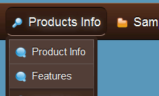
Drop Down Menus with CSS3 Text Shadow!
There is no longer any need to create Photoshop images to achieve a simple effect like shadow behind text!
 FREE download
 More demos
CSS3 Text Shadow
The text-shadow property is used as follows:
text-shadow:2px 2px 2px #000;
CSS Shadows take three length values, and a color. The length values are a horizontal offset, a vertical offset and a blur. Offsets may be negative or positive.

The text-shadow is supported by: Webkit (from Safari 3+, Chrome), Opera 9.5, Firefox 3.1(pre-Alpha), Konqueror.
See also:
CSS3 Rounded Corners,
CSS3 Shadow,
CSS3 Animation,
CSS3 Text Shadow,
CSS3 Gradient,
CSS3 Transition
CSS3 Text Shadow Effect
Text shadow is a cool feature that has been long expected of CSS3. There is no longer any need to create Photoshop images and upload them to the server specifically to achieve a simple effect like shadow behind text. It can be used to draw attention to the text, show off CSS3 text shadow feature or, in case of a navigation menu, simply for the purpose of style and good looks.
It is not really a new feature, since it was available in CSS2 as well, but the latest version has improved upon several key elements of the effect, allowing for more customization by web designers. It has also gained wider appreciation as speed and memory of an average computer improves, giving browsers a reason to get better at rendering CSS on the screen.
Curiously enough, Internet Explorer 9 still has not text shadow effect in their browser, planning it instead for IE10. Then again, it might not come as much of a surprise as Microsoft is always late to include all the latest features in their software. In fact, Internet Explorer has been relentless in avoiding support of text shadows, while browsers like Firefox, Opera and Safari have had it for years!
Either way, this is no reason to decide not to implement CSS3 text shadow effect for your navigation menu. Just keep in mind that Internet users with a version of IE below 10 will not be able to appreciate the amazing work you have done on your site. At least not the shadows.
The CSS3 text shadow feature creates Photoshop-quality shadows with style, but it is also very versatile. Creative website developers can exploit it to create even more cool effects that are sure to leave visitors wondering. For example, it is possible to create multiple layers of shadows and edit their colors in a way that would resemble flames. The result looks as if the letters were on fire!
This can prove to be a challenge for a website owner to actually pull off in CSS3, as can the simpler text shadow effects. Even if you master some of the features you need and will learn to implement them for your navigation bar, it can all be done much quicker using CSS3 Menu, the free software for building your own customized navigation menus with the least effort and time possible.
Despite what some people may think about seeing the implementation of text shadow, CSS3 effects are not just a fancy way of drawing attention to your site. Within the right templates and styles, nothing fits quite as nicely as letters that seem to cast shadows on the computer screen.
You may want to hold back this effect when it does not look good on your navigation menu, but when it does, it’s good to have CSS3 text shadow at your disposal. Just open CSS3 Menu, quickly build the navigation bar you like and switch between different types and colors of shadows to find the one that works best for your site.
Download Free CSS3 Menu
Recent Templates
FAQ
- June 25, 2014 Menu publishing error in html drop down menu
I am trying to import code into an HTML page. I follow publish instructions , after clicking insert and publish , it gives me a menu publishing error. What am I doing wrong?
- June 19, 2014 Single or Unlimited drop down menu css Websites licenses
Hi, I'd like to order your app. But I'm not sure what license I should buy. What is difference between Single Website and Unlimited Websites licenses? Thanks.
- June 04, 2014 Drop down menu html stopped working
Hello, I installed the trial version for later purchase the license. The problem is that after installing, I can not open the program. A message saying "CSS3 stopped working". I have Windows 8.
- May 19, 2014 Max number of css drop down menu activations
Number of installations . What does this mean? What is the Max number of CSS3Menu app activation on PC or Mac computers?
- May 14, 2014 Unlimited wbsites license of drop down menu
Hi, I'm going to purchase a license for unlimited websites. For my business needs, please verify that my purchase of the app allows me to design and sell website designs using the css3menu to an unlimited number of clients.
- April 30, 2014 Drop down menu bootstrap unlimited websites license
Hi, I would like to order CSS3Menu unlimited websites license. So can I use this unlimited on all of my and my clients sites??
- April 17, 2014 Upgrade single drop down menu html5 license to unlimited
I purchased the single website license. If in the future I need to upgrade to Unlimited website license, will I have to pay the whole amount? Thank you!
- April 14, 2014 Submenu isn't displaying at the bottom of the drop down css menu
Hi - I need your assistance in a menu I created with the paid version of CSS3Menu 4.9. The submenu isn't displaying at the bottom of the main menu item, but it displays at the lower half of the main menu item.
- March 18, 2014 Several drop down menu design on the same page
Hello, Can I have a vertical menu and a horizontal menu on the same page that use different templates? Thank you.
- January 14, 2014 Support drop down menu examples by phone
Is there a phone number that I can contact? I have some very basic questions.
- December 25, 2013 Use css drop down menu generator by cross frame
Hi guys, i would like to use CSS3 menu by cross frame. How can I set it ??
- December 24, 2013 Install css drop down menu free download on two computers
If I have downloaded the full versions of the css3meny, for MAC and for PC both, can I install and register on 2 machines, one being MAC and the other PC, or must I instead install on only 1 type of machine.
- December 24, 2013 Is css drop menu a subscription based product?
I want to make a purchase for a license. But the payment pages say that this is a subscription based product that needs to be renewed. What does it mean? Do I have to pay each year full price?
- December 18, 2013 Drop down menu tutorial does not run on Mac
Installed for mac and will not run. Error stating "not an authorized developer" please advice. Thank you.
- December 12, 2013 License period for vertical drop down menu css
Hello, I am very interested in this application, is this a once off payment or for a yearly subscription? Any insight would be most appreciated